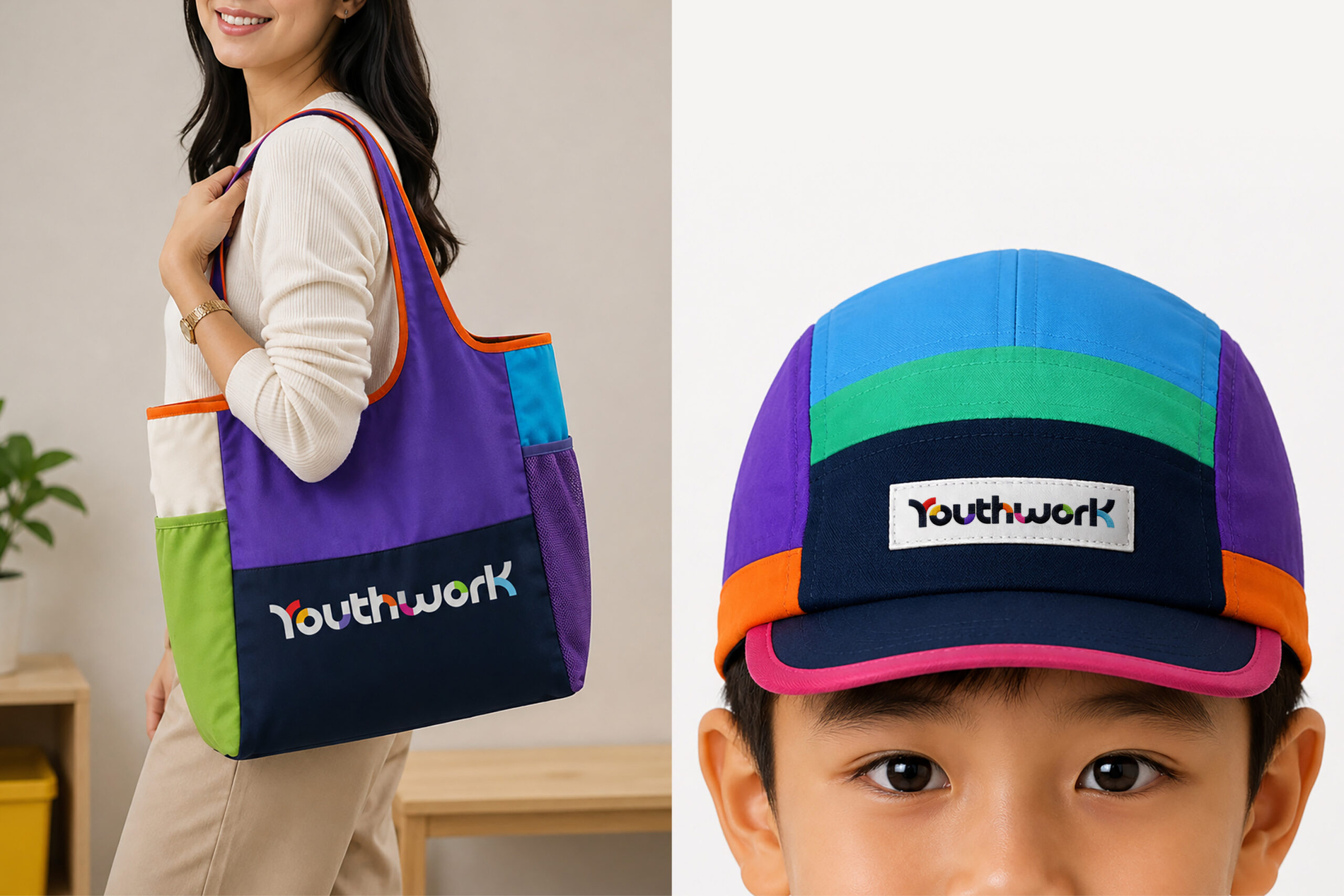
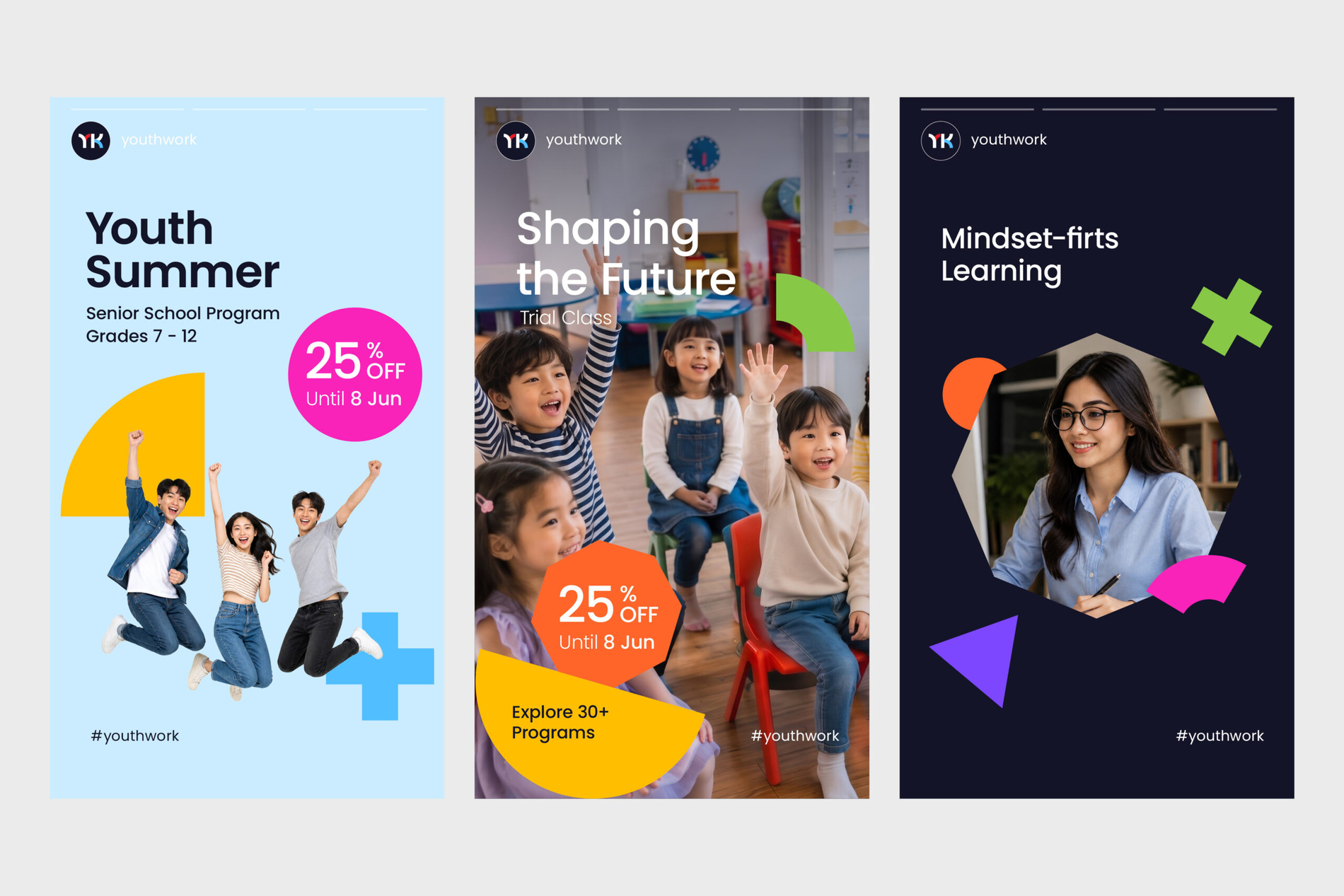
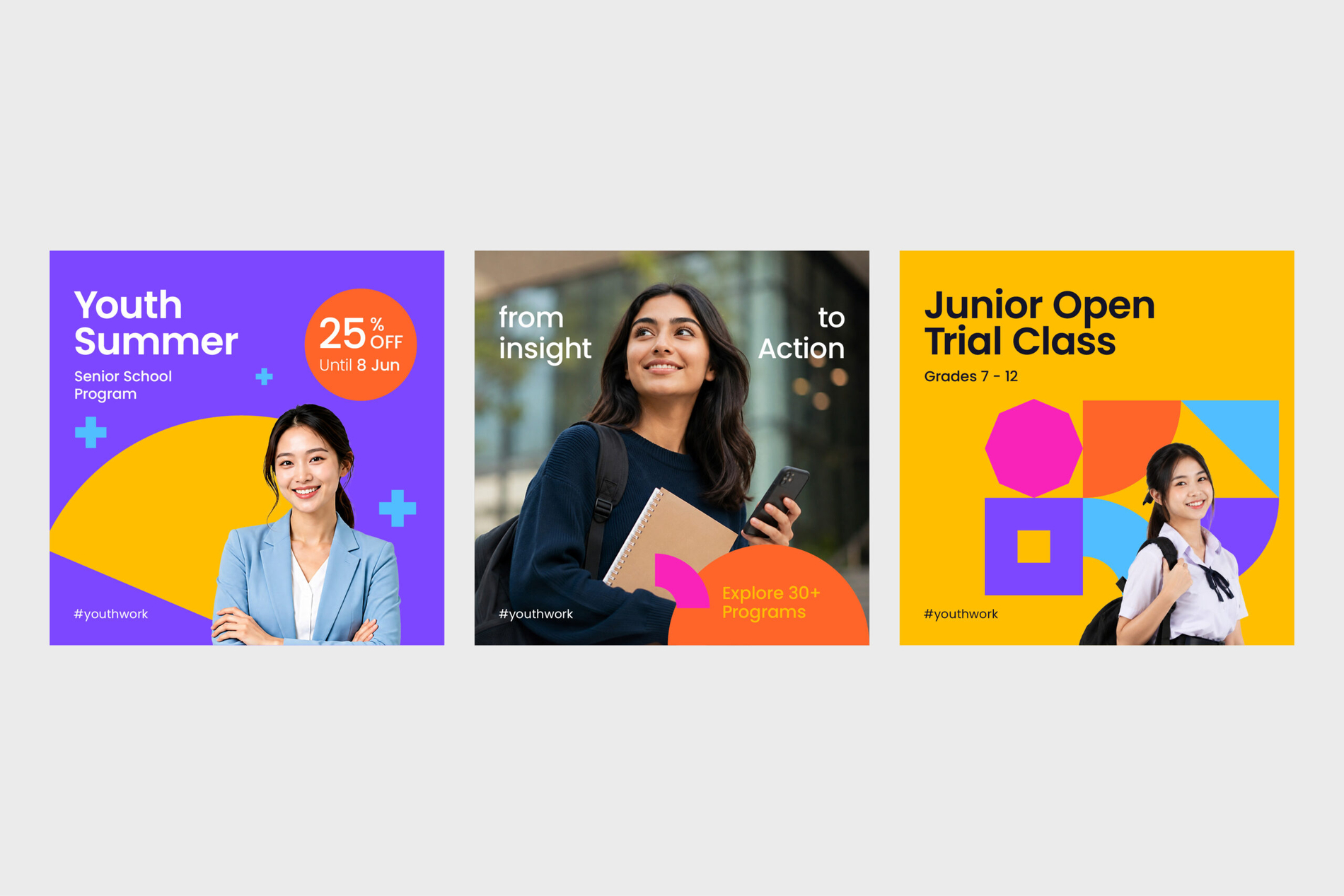
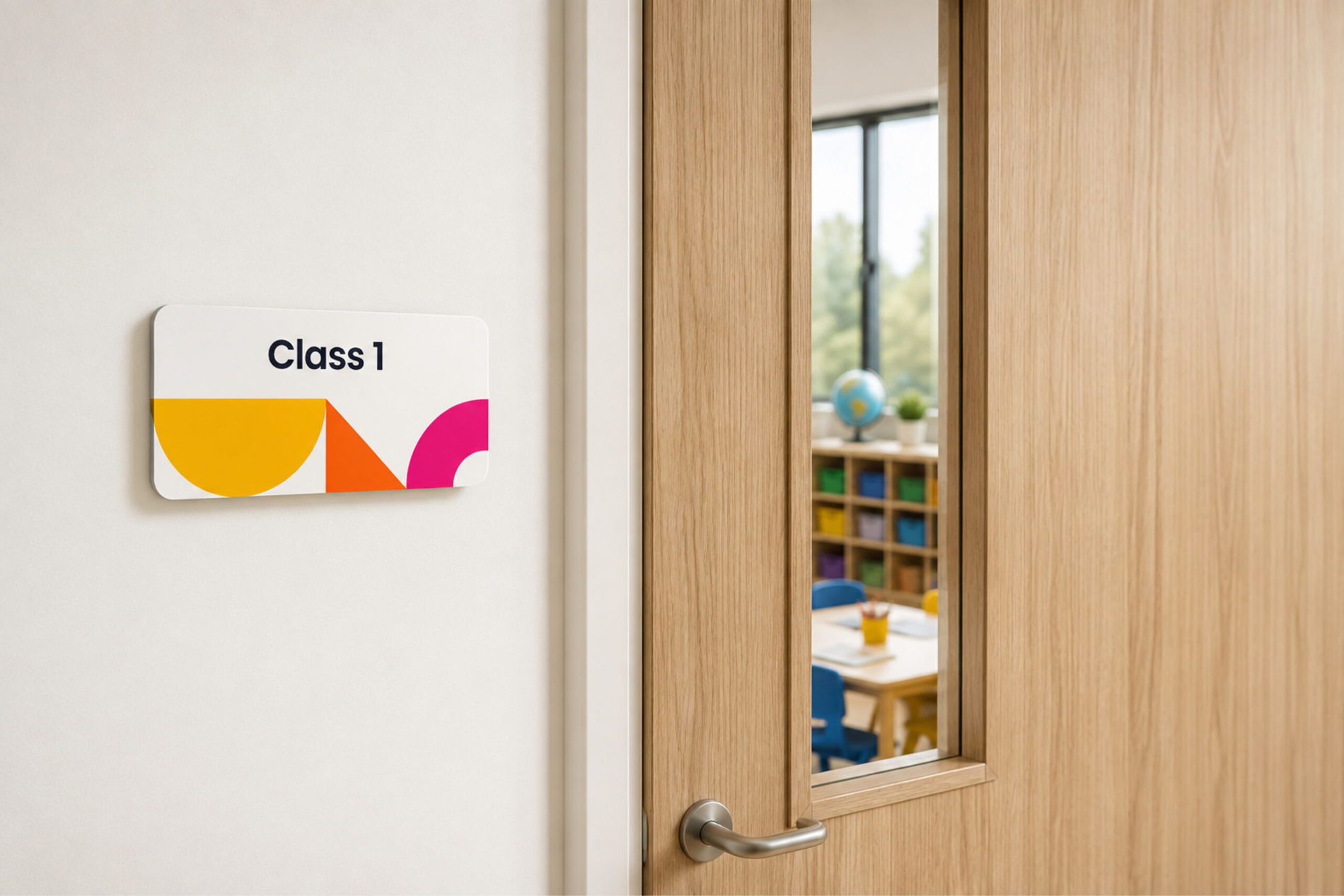
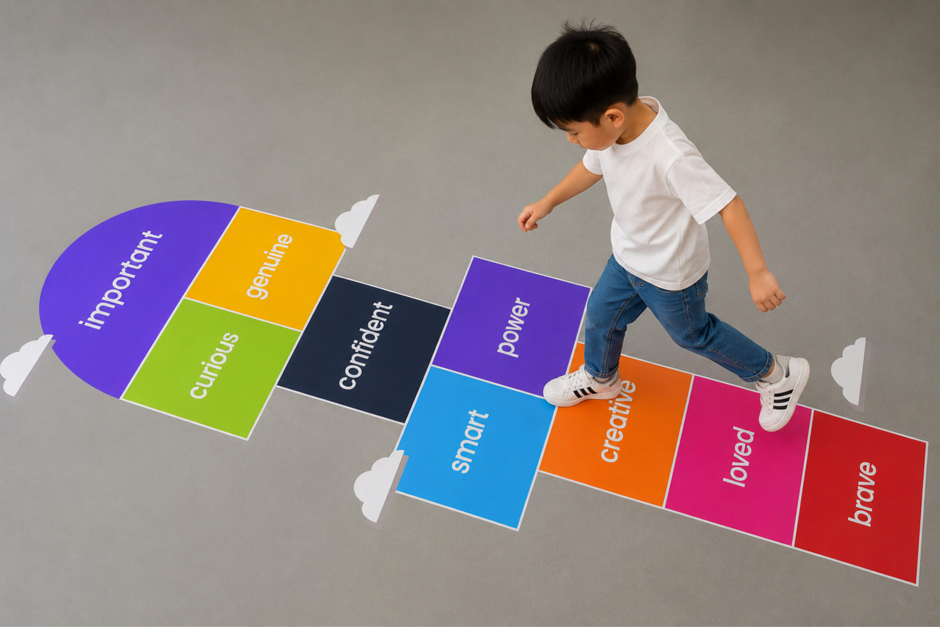
The name YouthworK is not defined by age. “Youth” represents a mindset—curious, open, energetic, and willing to explore—while “Work” represents the action required to turn that mindset into progress. Together, they establish a simple but meaningful proposition: learning is not passive; it is something we work through. Focus, consistency, practice, and engagement transform knowledge into capability, making progress a result of what we repeatedly choose to do.
The same philosophy shapes YouthworK’s brand values: Energetic, Insightful, Willing, Authentic, Inclusive, and Hands-on. These values define not only what YouthworK believes, but how the brand behaves. Energy creates engagement, insight creates understanding, willingness creates openness to change, authenticity creates trust, inclusivity creates belonging, and hands-on learning turns knowledge into experience. This allows the identity to work across YouthworK’s diverse programmes—from Playgroup and Kindergarten to Primary Grade 1–6, Specialty English, Mandarin, Math, and programmes for working adults—without losing its core character.
Client: YouthworK
Year: 2026
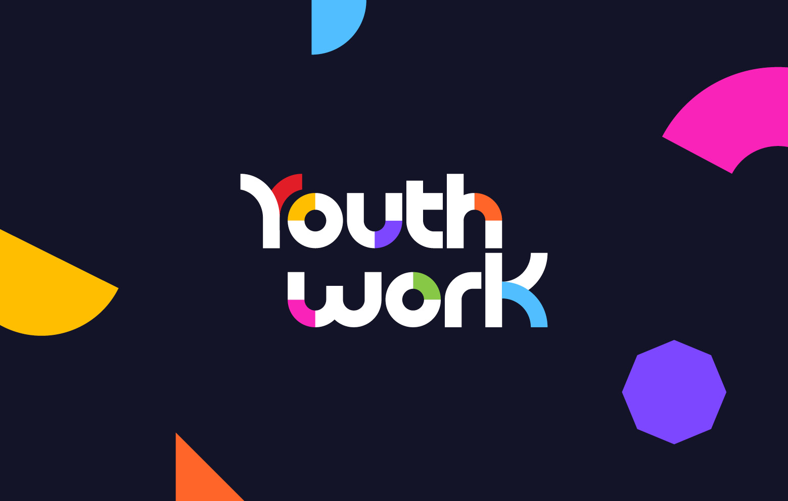
This thinking became the foundation of the brandmark. The logo represents learning as a continuous process of development, expressed through layered forms, dynamic rhythm, and evolving visual relationships.
The geometric accents integrated into the letterforms represent individual learning moments—small discoveries, challenges, experiments, and breakthroughs that may seem distinct on their own but become meaningful when connected. There is no single finish line; progress is built through accumulation. The consistent yet flexible character of the letterforms reflects the balance between insightful thinking and the willingness to adapt.
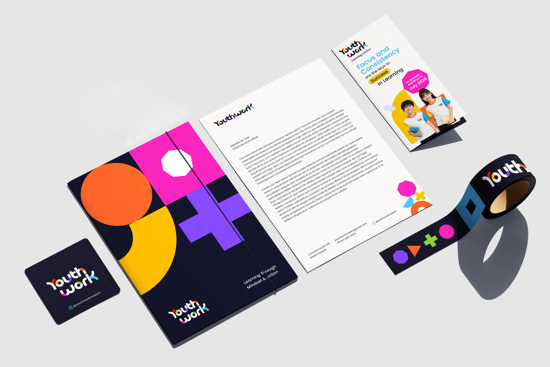
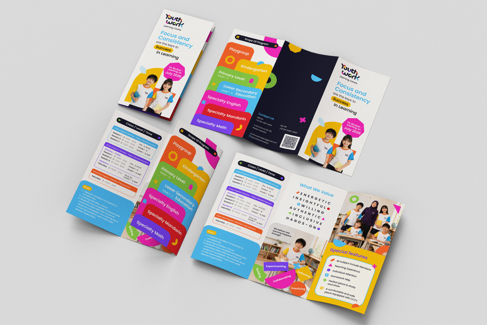
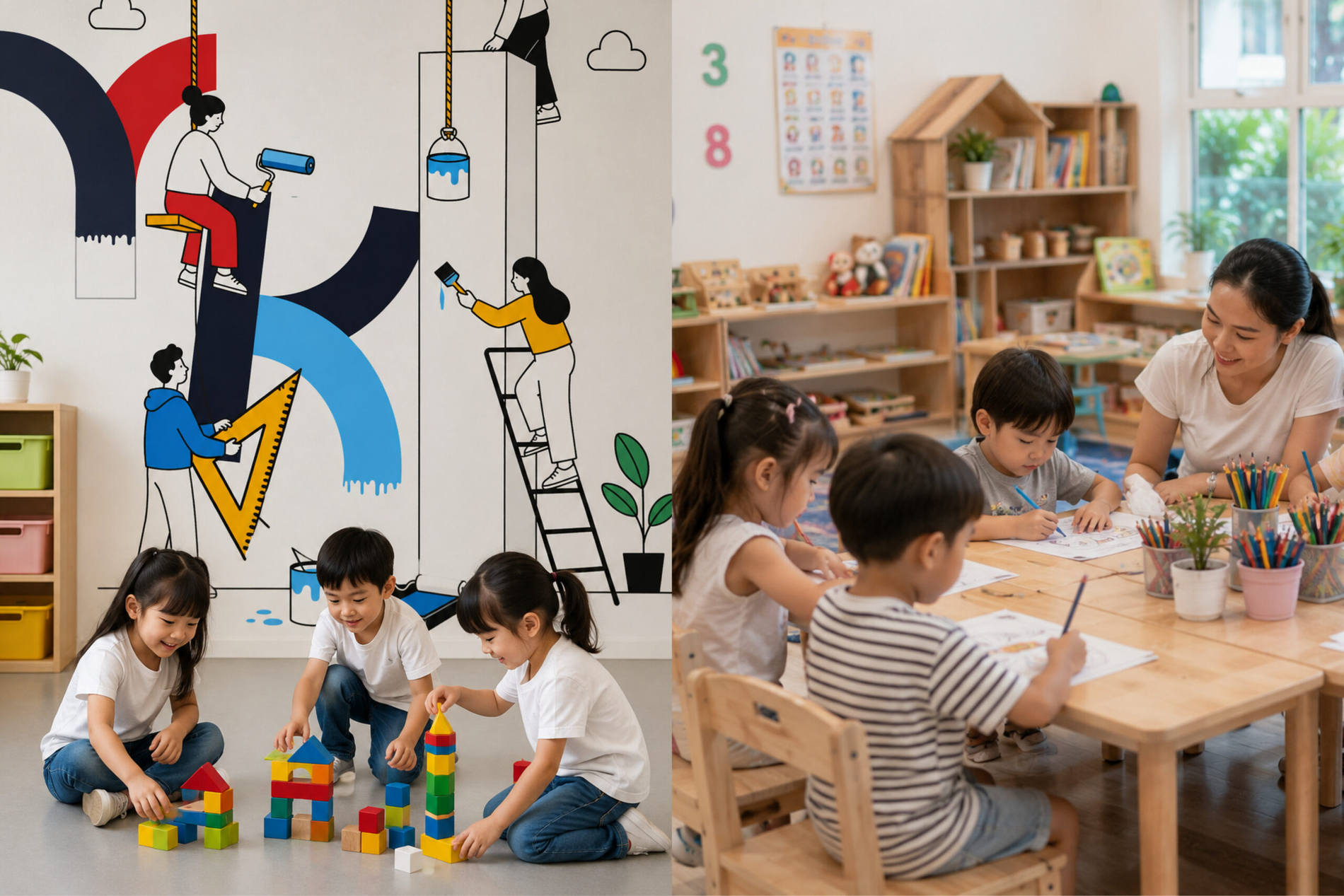
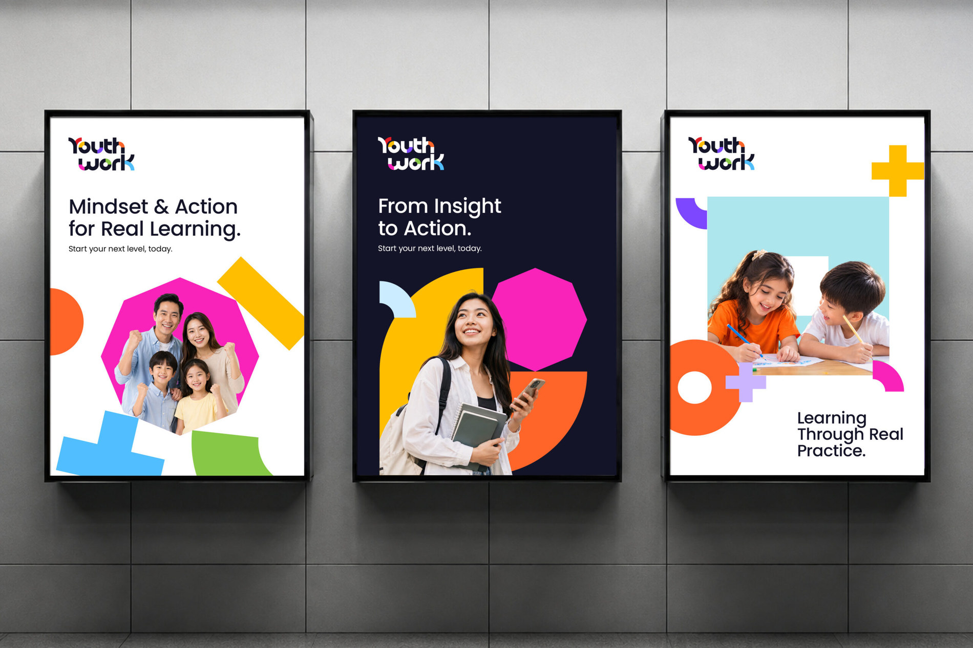
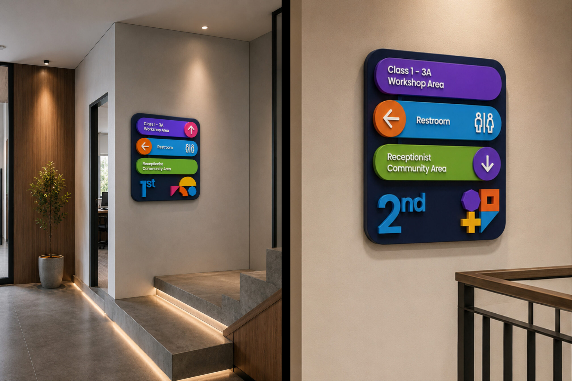
To translate the strategy into a recognizable brand world, Objekttheory developed a flexible visual system built from basic geometric shapes. Circles, crosses, blocks, frames, and other forms become visual building blocks that can be structured with consistency or arranged more playfully depending on the context. Their combinations reflect the stages of learning: building, experimenting, collaborating, reflecting, and practicing. The diversity of colours reinforces the idea of inclusive growth—different people, different experiences, and different starting points coming together within one learning system. Across spaces and communications, the system creates a visual expression of the same strategic belief: progress is not a single achievement, but the result of staying engaged with the process.