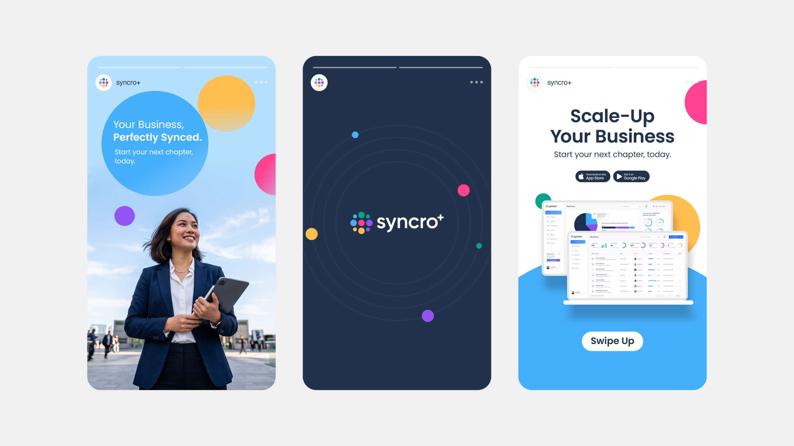
As a growing technology company, Syncro+ needed more than a visual identity. The challenge was to define a brand that could clearly express its role as a trusted technology partner—one that transforms disconnected systems into seamless business experiences through clarity, consistency, and purpose.
Objekttheory partnered with Syncro+ to shape its brand from the ground up. Through strategic positioning, brand identity, and a cohesive visual language, we translated a complex SaaS ecosystem into a brand that feels intelligent, approachable, and built for scale.
Client: Syncro+
Year: 2025
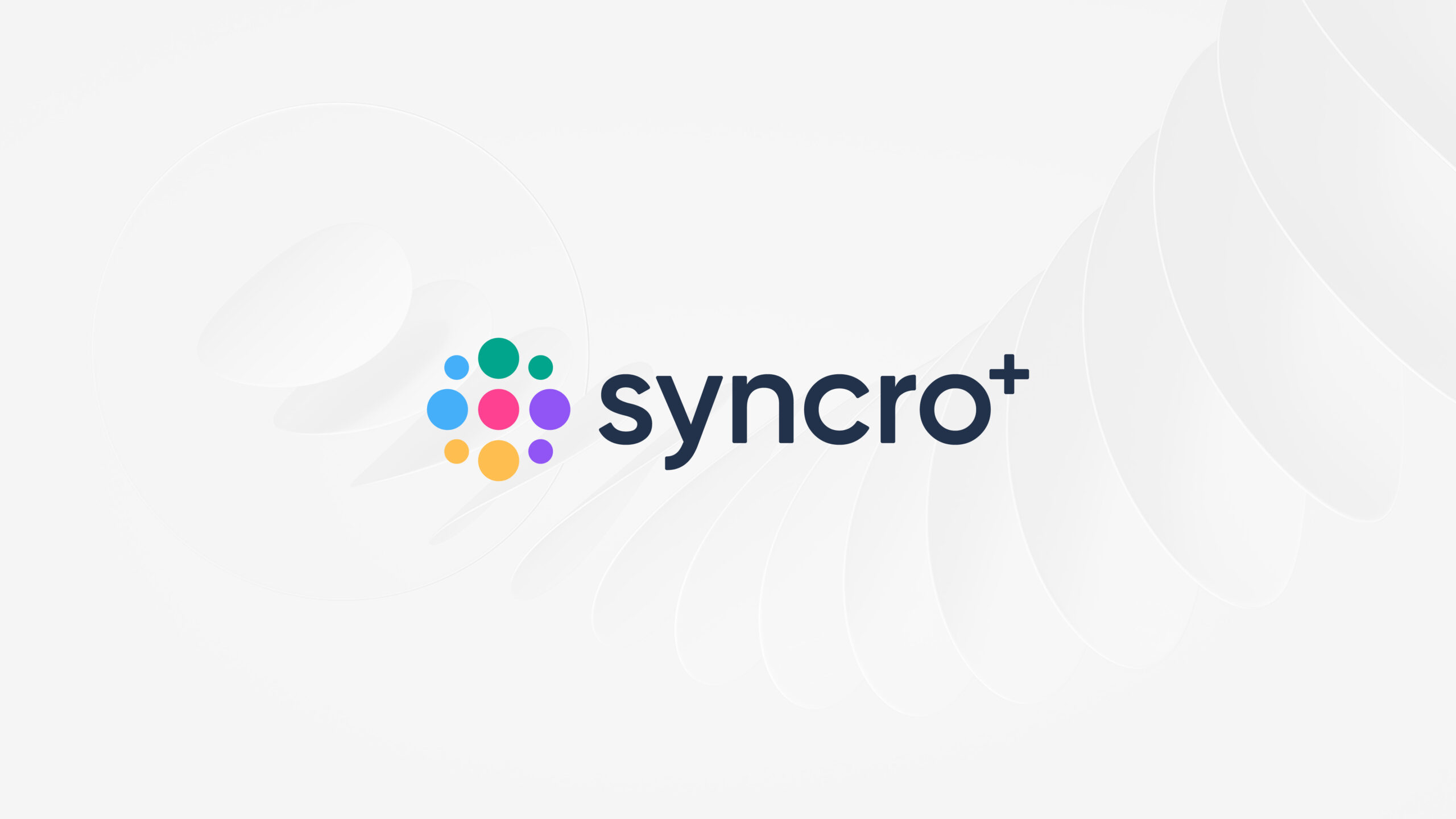

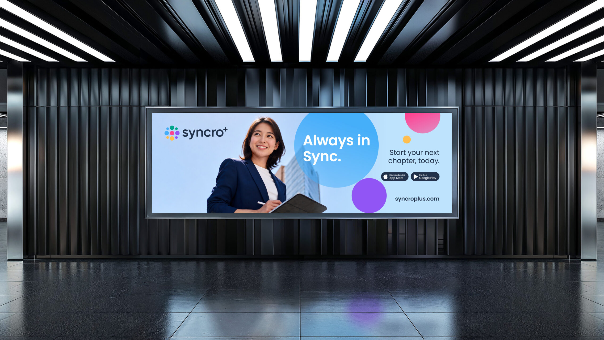
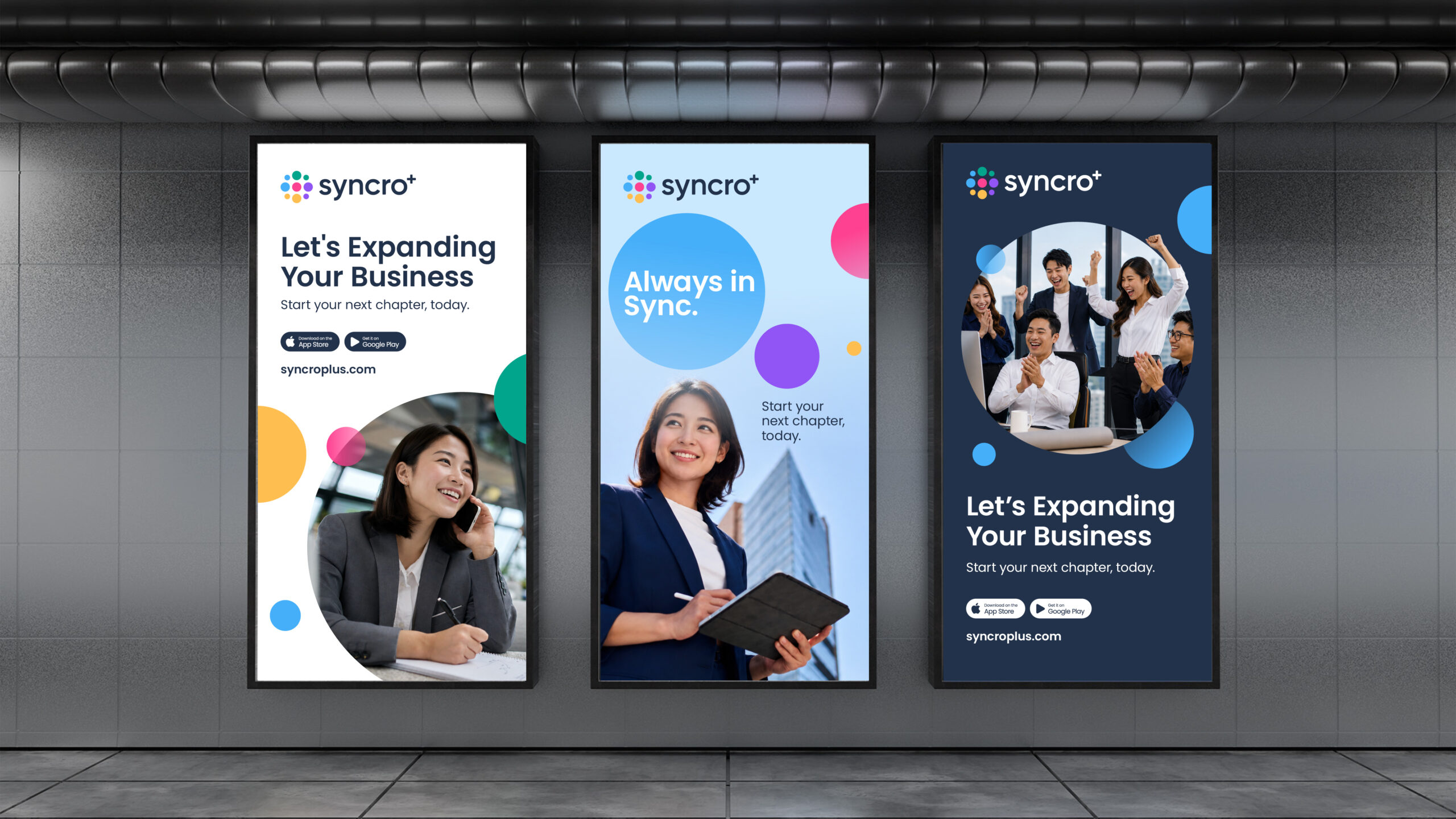
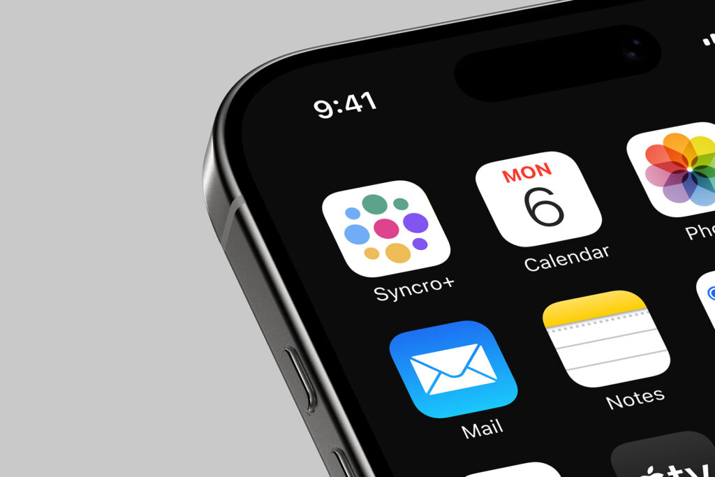
The identity is inspired by the idea of synchronization. A dot-formed plus symbol represents multiple business functions—POS, inventory, analytics, customer engagement, and more—working together as one connected ecosystem. This concept extends into a flexible visual system of dynamic circles, expressing movement, connectivity, and the continuous flow of information across every brand touchpoint.
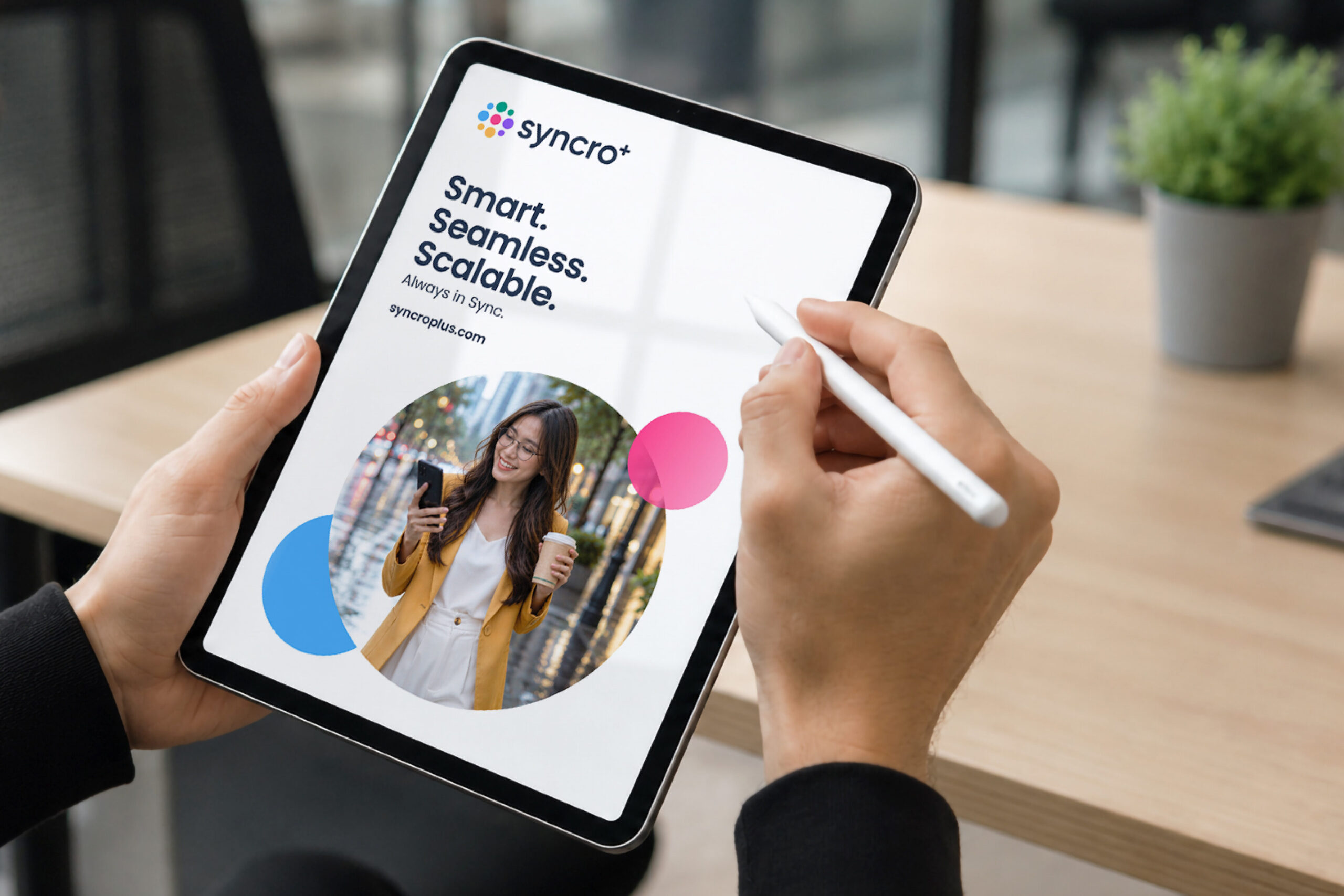
From brand guidelines and marketing collateral to digital communications and website experiences, we developed a scalable brand expression that reflects Syncro+’s promise of being Smart. Seamless. Scalable.
The result is a brand that communicates with clarity, grows with the business, and reinforces its position as a trusted partner in seamless business integration.